
About
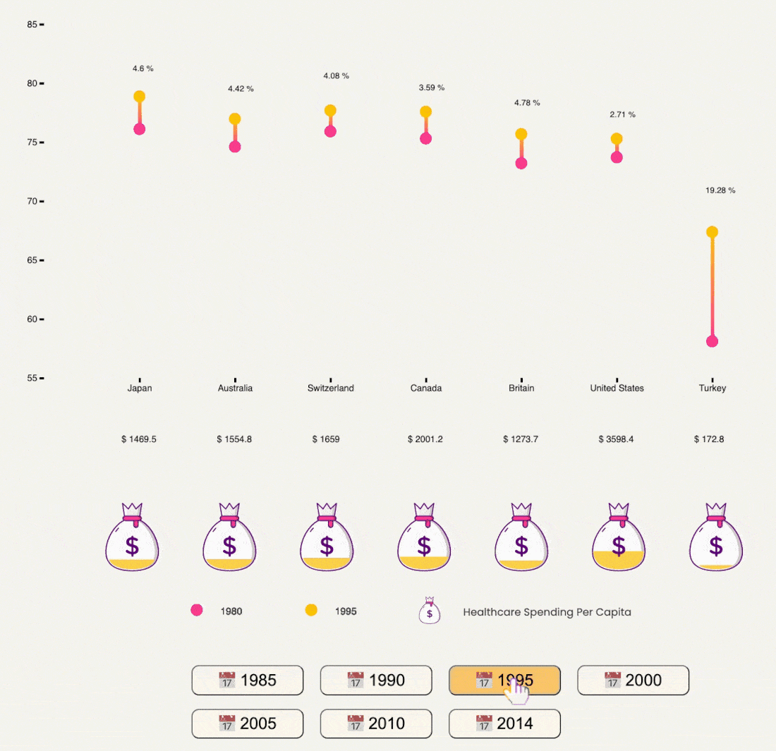
This project uses three linked visualizations to reveal health issues in the United States. The dumbbell plot first shows the correlation between healthcare spending and life expectancy in different countries, from which we may wonder why the U.S. spends a high amount of money on healthcare, yet the average life expectancy is lower than in many other developed countries.
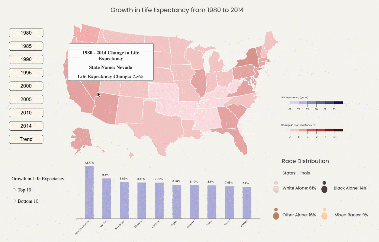
We explored the potential impact of different races on life expectancy and found that although those states that have a large percentage of the black race usually are low in life expectancy 2 decades ago, this distinction was narrowing over the period. We then used the bar chart to compare the cost of drugs and procedures in the US with other countries and found that the cost is much higher in the US.
THE HUGE SPENDING BUT
LOWER LIFE EXPECTANCY
IN THE UNITED STATES
Design: Hong, Luohan, Wenlin
Data Sources:
Why Americans Are So Damn Unhealthy, In 4 Shocking Charts, reported by BuzzFeedNews on May 25 2017: BuzzFeedNews
Census data - Populations and people, reported by United States Census Bureau: United States Census Bureau
This project uses three linked visualizations to reveal health issues in the United States. The dumbbell plot first shows the correlation between healthcare spending and life expectancy in different countries, from which we may wonder why the U.S. spends a high amount of money on healthcare, yet the average life expectancy is lower than in many other developed countries. What factors could be contributing to this problem?
We explored the potential impact of different races on life expectancy and found that although those states that have a large percentage of the black race usually are low in life expectancy 2 decades ago, this distinction was narrowing over the period. We then used the bar chart to compare the cost of drugs and procedures in the US with other countries and found that the cost is much higher in the US.
Healthcare Spending and Life Expectancy in 7 Countries
Aspect
This chart shows the association between healthcare expenditure and life expectancy in different countries from 1985 to 2014. The expenditure and life expectancy increased in all selected countries, but unexpectedly, the life span of populations in the US is not increasing as rapidly as its spending.
Visual encoding and interaction
The dumbbell dot plot is used to visualize life expectancy at two different points of time. By clicking the buttons, audiences can see the growth in life span and healthcare expenditure over this period.
Design Element 1: Money Bag Icon - visually represents how much money has been spent in the healthcare industry.
Design Element 2: Dumbbell Plot - yellow and red represent two different points of time, and the length between two time points indicates the growth rate (%).
Data Type
X axis: Country (nominal data)
Y axis: Life Expectancy (quantitative interval)
Year (quantitative interval)
Healthcare Spending Per Capita (quantitative)
Data transformation
We calculate the growth rate in life expectancy. All selected years will be compared with the year 1980.
(x-y)/y
x: life expectancy in the selected year
y: life expectancy in 1980
Life Expectancy Distribution & Race
Aspect
This visualization shows the change in life expectancy from 1980 to 2014 in different regions of the United States. Through comparison data of each region, we sought to explore the relationship between life expectancy and race.
Interaction Element
Buttons record the life expectancy of populations in a given year, which enable audiences to see the change in ages across all U.S. regions over time. Hover interaction is also used in the map to present the detailed information (e.g. the state name and exact life span). Except for presenting the data, we explored if races would affect people’s life expectancy. Users can hover the bar chart beneath the map to see the percentage of each race in the whole population and if there is a correlation between races and life span.
Data Type
Position: Bar chart: X Axis: Location; Y Axis: Growth rate of life expectancy
Scale & Color: Purple and red are selected to show the data for each year and the overall trend in the choropleth map. The color values has been ranged into six levels to map the data.
Data transformation
Life expectancy data: The overall trend for all regions are shown as percentage data on the map. The top 10 and bottom 10 locations for growth rates are also selected and ranked on the bar chart.
Race data: Race was divided into four sections. White-only and Black-only were selected separately for comparison because they make up a larger percentage of the population. The rest of the population was divided into other alone races and mixed races.
America's sky-high Drugs & Procedures Cost

Aspect
This horizontal bar chart demonstrates and compares the cost of diagnostic methods and drugs in four developed countries, and shows if the selected procedures or medications are covered or not covered by health insurance (either state health insurance or private health insurance). From the chart, the audience can see the cost of disease diagnosis and medications in the United States is much higher than in most developed countries. In terms of insurance, although most tests are covered by health insurance, the fee-for-service model in the health care system encouraged some unnecessary expenditure on expensive tests and treatments (BuzzFeed, 2017).
Interaction Element
The bar chart compares the costs of six drugs or procedures in four developed countries. Users can see the cost of different drugs and whether they are covered by health insurance by clicking buttons of each categories. Moreover, the tooltip tool is also embedded in this bar chart. Users can hover their mouse on each bar to find more information.
Scale
x Axis : domain (0, max number of each group of data); range (0px, 610px)
y Axis : The five countries are equally distributed on a vertical line of 0px-300px
Data Type
X Axis (Quantitative): price per diagnosis/treatmenty
Y Axis (Nominal): country
Insurance coverage situation (ordinal): fully covered, partially covered, or not covered
Value, hue, color
