
About
This project was designed to visualise non-violence crime data in New South Wales during the epidemic. By visualising this data we wanted to provide an interactive graphical representation of non-domestic violence assault during the epidemic in a clearer, more interesting and more accessible way.
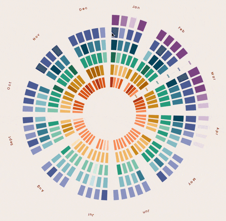
This viz project focuses on one crime category: non-domestic violence-related assaults in NSW from Jan 2015 to Apr 2020. We create a circular heat map to visualize the density of crime cases by which target audiences can quickly grasp the monthly and seasonal distribution of crime and possibly take some precautionary measures. When users put their mouse on the block chart, the data corresponding to each colour block will then appear in the centre of this chart.
VIZ OF NON-DOMESTIC
VIOLENCE RELATED
ASSAULTS
Reported By NSW
2015 - 2020
Data Source: COVID-19 Pandemic and crime trends in NSW Reported By NSW Bureau of Crime Statistics and Research
Average Data By Year

As audiences can hardly compare the crime incidents between different years in the circular heat map, we calculated the average number of Non-DV Related Assaults per year and presented it in a graphical way by combining lines and numerical information. This give the audience a clear insight into the average crime number and trends in these six years.
There was an overall increase in the average number of non-domestic violence-related assaults from 593 cases per week in 2015 to 621 cases in 2019, despite the slight decrease in 2018.
There was a seasonal pattern in the number of non-domestic violence-related assaults. The figure for this crime category was comparatively lower from June to September (winter) and higher from November to March (summer).
During the Covid-19 period (15 March to 26 April 2020), the number of non-domestic violence-related assaults decreased dramatically and reached the lowest level at 320 on 19 April 2020.
Main Story

Why Circular Heat Map?
The rich colours and vivid information expressions in the heat map can make the visualization interesting and grab audiences' attention easily. Besides, the raw data shows an apparent monthly and seasonal distribution, so we use a circular heat map to make this distribution more visible, as the users can quickly see the spacial distribution of data through the lightness change.
Visual Encodings
In the data sorting process, we first classify the data by year. Each year's data is divided into 12 sections by month and then broken down and presented weekly.
Position & Size
X Axis: Month (Ordinal Data)
Y Axis: Year (Nominal Data)
Z Axis: Non-DV Related Assaults (Quantitative Ratio Data)
Rectangles with different widths are used to indicate the number and variation of incidents per week.
Orientation & Shape
Rectangles stand for weekly crime data. They form a circle to present the annual data. These circles for each year are arranged in chronological order from the inside out.
Scale
Linear scale is used to define the width of each rectangle in the circular heat map, and ordinal scale with lightness changes are used to define the range of data values.
Position & Size

Colour differences are used to provide audiences with better visual cues. As data of each year is presented as nominal data, we use the hue sequence from red in 2015 to purple in 2020 to make each annual category distinguishable. As the number of Non-DV related assaults is quantitative ratio data, the difference in lightness between dark and light is chosen to show the criminal incidents from high to low. Finally, the incidents are presented by the combination of hue and lightness to indicate the density of incidents within an annual and monthly category.
Design : Xiong Hong Wenlin Wang Luohan Liu